

Zeit Time Travel Tourism
A Responsive E-Commerce Travel Site
Role:
UX Designer, UI Designer, UX Researcher
Conceptual Project
Design Brief:
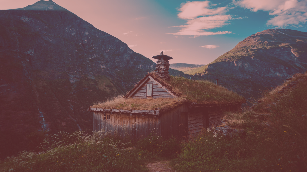
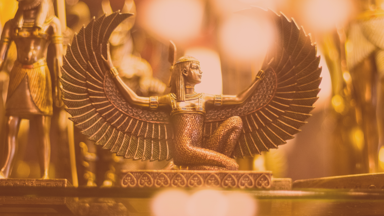
As time travel has become open to the public, Zeit wants to create an e-commerce tourism site that offers different travel packages to 289 destinations in the past all over the world. The goal is to make it as easy as possible for customers to search for travel packages and book their trips and experiences through a responsive website.

Research
Research Goals
Priorities
What are the priorities of users who are booking trips?
Trip Interests
What type of trips are appealing to users?
Frustrations
What are frustrations with booking trips online?
How the process can be made easier for users?
Secondary Research
Secondary research was conducted by looking at preexisting travel sites, and assessing their strengths and weaknesses.
Competitors & Competitive Analysis
User Interviews
6 participants were interviewed with questions in several categories to understand their travel habits and motivations, feelings, goals, pains, and time travel trip interests.
Interview Topics
General Travel
Choosing destinations & Trip Planning
Booking a Trip
Historical Interests
Time and Space Travel
Interview Subjects
Millenial with Fiance
Gen X Married Couple
Millenial with Long-term Partner
Single Millenial 1
Single Millenial 2
Older Millenial with Kids
Interview Results
Habits & Motivations
Participants were split up as to whether they preferred to book a trip online themselves or whether they wanted to speak to a person on the phone when booking trips
Many wanted to experience their trips with friends and family, much of their choice was based on that
Multiple people liked sites that showed reviews and pictures to help solidify their travel choices
Time Travel Interests
Ancient Greece
Seeing the Gettysburg address given
England/UK ranging from a Pagan era to the 1800’s
Seeing America before it was settled by colonists
Feelings
Relaxed
Excited
Stressed
Goals
Some were more focused on staying within a budget or finding deals
Others were focused on trying new experiences
Pains
The stress of booking online and all the steps involved
Worrying about booking a trip on separate sites
Cost of trip & staying within budget
Persona

From my research findings, I wanted to accomplish the following in my design:
Lessen the stresses of booking travel and make users feel relaxed
Find a compromise on trips for a range of budgets
Include both new and exciting experiences and relaxing ones
Make sure there is an option for both online booking as well as a contact point via phone or online chat
Show a range of locations and time periods
Make sure to include lots of pictures and reviews on travel locations

Information Architecture
Card Sorting
Card sorting was used to establish a categorization system for the site. The card-sorting exercise was conducted as follows:
7 participants
22 cards were created, made up of different hypothetical time travel trips and activities to see how participants would categorize them
Participants took between 5 and 13 minutes to sort cards
Standardization Matrix

Card Sorting Results
Time Periods
Prehistory
Ancient History
Modern History
Locations
Europe
Asia
Americas
Africa
Middle East
Vacation Length
Day Trips
Long Weekend
Longer Trips
Activity Type
Arts & Entertainment
Experiences
Exploration
Tours
Sitemap
The categories established in card sorting were utilized in the sitemap.

Based off of the card-sorting, I chose to go with 3 different categories to browse trips on the site’s navigation:
Time Period, Location, and Activity Type.
Interaction Design
Task Flow
I created a task flow to show how a user would book a trip, either by searching for a specific time/place or browsing in one of the site's sections before finding a trip to book.

Wireframes
The low fidelity wireframes were structured around the task flow: browsing for for a trip, search results, a trip details page, and booking a trip through a checkout section. They were designed responsively with desktop, tablet, and mobile versions.
Key Wireframes

Homepage

Search Page

Trip Details Page

Checkout Page
Responsive Lo-Fi Wireframes

After creating the low fidelity wireframes, I began the process of branding for the user interface.
UI Design
Branding
For Zeit’s branding, I wanted to invoke a modern, yet classical look. The branding consisted of retro-inspired colors and fonts, inspired by vintage travel posters.
Palette
Zeit’s palette was a cream light neutral and dark blue for text, and the accent colors are gray-blue, orange, and red.

Logo
The logo was a simplified icon of an hourglass, intersected with an arrow pointing in a counter-clockwise direction to signify traveling back in time.
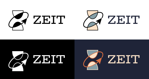

Type
I used Serif font for headers and titles that gave the site a vintage look, and a Sans Serif font for body and navigation text.

User Interface
Using the chosen colors, logo, and overall look, I modified my wireframes to fit with Zeit’s branding.


Once I had created Zeit’s branding and high-fidelity wireframes, the next step was to create a prototype and perform usability testing.

Usability Testing
Prototype Testing
The usability tests were run remotely on Zoom and recorded for further viewing. Participants shared their screens with me, and were given a link to the prototype. They talked through their process as they navigated the tasks given to them.
Task 1
Book a trip to Edo Period Japan for themself and 1 other person. They could do this either with the super search bar, OR they could find the trip overview page through the featured destinations. I gave them dates to input on the super search bar (May 8-14)
On the Trip Overview page, I observed which “Book Trip” CTA button they chose.
Finally, users completed booking a trip through the checkout process
Task 2
Find the trip overview page to Ancient Greece. The prototype only had the ability to access this page by clicking on “Browse By Time Period”. I observed the other ways participants attempted to find this page.
When the participants reached the “Browse By Time Period” section, they could either scroll down to find Ancient Greece in the “Ancient History” section, OR click on the “Ancient History” filter checkbox to filter the results to only show trips under “Ancient History”
Prototype Version 1
The prototype shared with the user testing participants.
Affinity Map
Results of the usability tests were gathered and sorted in the affinity map.
Prototype Version 2
The resulting prototype iteration after fixes and suggestions from participants were implemented.

The user testing was a success. The common feedback from participants was:
The checkout process and super search bar made sense to them
It was straightforward and intuitive
They liked the aesthetics and look of the site
They liked that there were different options for browsing for trips

Conclusion
Key Takeaways
Research & Interviews
Coming up with questions to ask in the user interviews was difficult, but I learned a lot of valuable information from one-on-one interviews.
Scheduling interviews and working with others takes more time than I realized. Planning ahead is important.
UI Design
UI Design and branding was the part of the project that interested me the most. I loved choosing the palette and figuring out how I wanted the site and brand to look.
Wireframes were something I had little experience with, but proved to be a key building block for the project.
Interaction Design
People have different ways of browsing on sites, so there needs to be a number of options for users to navigate and search.
There was a learning curve involved in prototyping, and it was interesting to see how people interacted with the prototype even when they couldn’t actually click on sections
In the end, I was able to accomplish my original goals of finding out the priorities of users browsing travel sites, how to make browsing and booking on a travel site a painless experience, and what types of trips interested a variety of users.
More Case Studies

Creative Fitness with Colleen:
Responsive Personal Training Site

Adding a Feature to Artfol:
Search and Filter Features